Where Should Text Go on Reels, Shorts and TikTok?
By Modisign
- Published
- Updated
- Last tested
Start with titles and CTAs in open space toward the upper middle of your vertical video, with breathing room from the edges, then adjust them against the destination’s visible controls and description. Check the whole animation, not just its resting position. This is a design starting point: the official guidance verified here does not establish one universal pixel rectangle for organic Reels, Shorts and TikTok.
What should you prepare for a text-placement check?
An overlay is a graphic layer over your own footage. A safe zone is the area you reserve for essential words so they remain readable alongside the viewing interface.
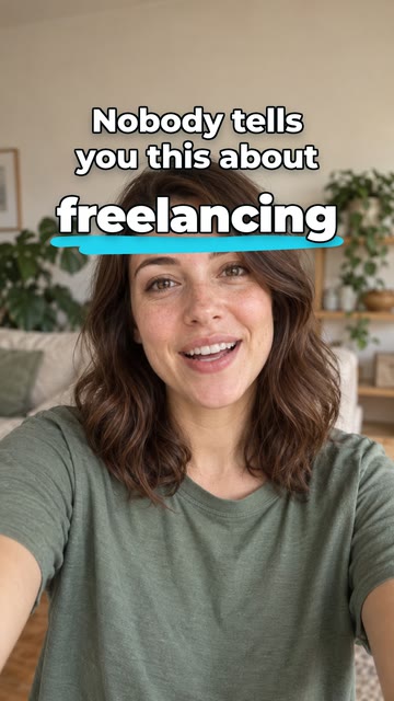
Illustration of the free Career truth preset over sample footage. The illustrative creator footage is not included in the download; this is not a receiving-editor or platform test.
Have your footage, an editor, the intended description and subtitles, and a phone for checking the result. Plain native text is enough for a static message; a rendered element is useful when you want ready-made motion.
How do you place text clear of the interface?
Choose one essential message. Write a short title or action you can read at phone size. According to CapCut’s guide, Text → Add text adds native text. YouTube also documents Text in the Shorts editor. Start there if you do not need a separate animation. CapCut text instructions, YouTube text tools.
Find open space in your footage. My suggestion is to begin above or beside the subject, toward the upper middle, leaving room at every edge. Check the next shot too: a title that clears a face in one frame may cover the demonstrated action after a cut. The expected result is readable words without losing the subject.
Choose motion only if it helps. Browse hook-title animations and select a Free badge, or use the tested free Career truth configuration. Free elements download as they are as green-screen H.264 MP4, without sign-up or watermark; Background and Format remain selectable. For layering and removing the green background, follow CapCut’s documented overlay and chroma-key controls.
Move the whole graphic into the available space. According to CapCut, mobile overlays can be dragged and resized by pinching; desktop resizing uses corner points. Judge the card, underline and moving details as well as the letters. CapCut positioning guide. Do not shrink a long message to fit: shorten it or show its parts separately.
Use the destination’s placement aids where documented. According to YouTube, create a Short, record or upload a video, confirm it, then add text or stickers. Moving those elements reveals visual guides; edge warnings and control icons indicate possible obstruction. YouTube visual-guide instructions. These instructions concern native elements; they do not establish that YouTube can reposition words already rendered into an imported clip.
Review timing and save a test. According to YouTube, Timeline lets you drag a text clip’s start and stop points, and its guide recommends reviewing placement before publishing. Shorts timeline guidance. My suggested check is to watch the saved video at phone size from entrance to exit, then inspect the destination preview with your intended description and other text present.
Which areas should you inspect, and do caption lengths matter?
YouTube’s official visual-guide documentation identifies like/comment controls, the video description and screen edges as possible obstructions. It warns that edge placement can hide content on some devices. Shorts visual guides.
For any destination, use those categories as a checklist, rather than copying an assumed location: look for controls beside the video, information near its bottom and navigation near its edges. We have not verified their exact organic layout on Instagram or TikTok in this run. Check the interface you actually see before placing essential words there.
Distinguish the post’s description/caption from subtitles, the words showing speech inside or over the video. TikTok’s June 2026 ad specifications explicitly say safe-zone size depends on dimensions, ad caption length and additional formats. That is documented for ads, not a verified organic-caption formula. TikTok ad safe-zone specifications.
My recommendation is to review with the real description and subtitles, including the longest subtitle line. If text areas compete, move the graphic or stagger their timing. Do not remove useful subtitles to make room for a decorative reminder.
Are ad safe zones the same as organic-post safe zones?
Treat an ad template as guidance for its specified placement. TikTok supplies different ad safe-zone files and warns that previews can differ slightly from live display because the preview is not device-specific. That does not certify a shared organic layout across three apps. TikTok ad specifications.
Meta’s detailed safe-zone help page required login when checked on October 8, 2026. We could not verify numerical Instagram margins from it, so this guide gives none. Nor does the render test establish organic clearance. Use current destination previews and retain an editable project so you can adjust placement rather than relying on a supposedly permanent rectangle.
How should a lower third move in vertical video?
My design suggestion is to treat a lower third (a name-and-role graphic) as a movable introduction, without insisting it sits at the frame’s bottom. Try it below the face but above the text area you observed, or beside the speaker when that space is clear. Keep the entire entrance and exit clear of important footage.
| Problem | Check | Suggested adjustment |
|---|---|---|
| Name competes with subtitles | Longest subtitle while the name is visible | Raise the name card or show it at another moment. |
| CTA touches a control | Full animation, including moving details | Move the complete layer inward. |
| Title clears the interface but covers the task | Hands, tools and the next shot | Use a different open area or timing. |
| Words fit but are hard to read | Phone-size playback on changing footage | Shorten the wording and strengthen contrast. |
These are layout suggestions, not tested compatibility results. For contrast, W3C’s WCAG guidance specifies 4.5:1 for ordinary text and 3:1 for large text. Use that as a reference when choosing lettering and its background plate; contrast alone does not prove the video is accessible. W3C contrast guidance.
Three suggested arrangements: an opening title above the subject; a name card during an introduction with no competing step label; and a closing reminder after the demonstrated action finishes. Browse lower-third overlays for names or follow-button overlays for a reminder. A rendered Follow button is a visual prompt, not a clickable platform control.
What should you check before posting or customizing?
Replay the entrance, readable state and exit. Read each line without pausing, inspect both bright and dark footage, and check the destination with the intended text present. Repeat separately for each destination. This is a review procedure for you to perform, not a claim that we tested those apps.
For custom wording and styling, Modisign Pro is $9/month plus applicable tax and unlocks text, look, colors and the available size/position controls for every overlay. Hook titles have Size, Vertical and Horizontal controls. Lower thirds have Size and Horizontal (Left, Center, Right or Custom); move that rendered layer in your receiving editor for vertical placement. Customized downloads require sign-in and Pro.
Transparent VP9 WebM with alpha, the information storing transparency, is offered on desktop, including for unchanged free presets. Receiving-editor alpha support was not tested here; verify import and the saved composite in your exact editor version before choosing it. Start with an unchanged free overlay for the demonstrated MP4 route.
Apply the same destination-preview check to opening titles, portrait name titles, and subscribe or follow reminders.
Frequently asked questions
Is there one pixel-safe rectangle for Reels, Shorts and TikTok?
This guide does not establish one. The verified sources describe Shorts visual guides and TikTok ad safe zones, not a shared organic-post rectangle. Start with breathing room around essential words and inspect each destination with its current interface before relying on the placement.
Do longer captions leave less space for my title?
TikTok explicitly says ad caption length affects its ad safe zone. That does not verify the same rule or a fixed margin for every organic post. Include your intended description and subtitles in the placement check, and move the graphic if the visible text areas compete.
Can I reposition a free Modisign overlay?
In the standalone overlay editor, free users can change Background and Format while the other preset controls stay locked. Studio allows overlay edits, but a configuration that no longer matches a free preset needs Pro to export. After downloading, you can position the rendered layer in a receiving editor that supports it. Pro unlocks the available layout controls in Modisign; the lower-third family has Size and Horizontal (Left, Center, Right or Custom), with no Vertical control.
Does a rendered Follow button become clickable?
No. It is an animation layered over your footage, not a platform control. It does not follow an account, create a link or send a message. Keep its wording understandable as a visual reminder.
Related reading
Sources and test details
- YouTube: Shorts visual guides indicate possible overlap with like/comment controls, video descriptions and screen edges; documented native text and guide workflow — accessed
- YouTube: Timeline controls text start/stop points and the guide recommends reviewing text before publishing — accessed
- TikTok ad specifications: safe zones depend on dimensions, caption length and additional formats; ad preview can differ from live device display — accessed
- CapCut: native Text/Add text, mobile drag/pinch positioning and desktop corner-point resizing — accessed
- W3C: WCAG 2.2 minimum contrast guidance specifies 4.5:1 for ordinary text and 3:1 for large text — accessed
- Access limitation only: redirected to login during this check; no Instagram safe-zone dimensions verified — accessed
Tested in Modisign modisign.app, October 2026 on Desktop browser: On October 8, 2026, exported the unchanged free Career truth preset with default Green screen: 1080×1920 H.264 MP4, 30 fps, 105 frames, 3.5 s. We checked the file; an extracted frame at 2 seconds showed the white hook title and cyan underline on green. No receiving-editor import or organic-platform preview was tested.
Tested in Modisign Local Modisign site, October 2026 on Desktop Chrome on macOS: October 14: Checked the Career truth illustration and corrected its free link to include the saved text styling. Reviewed the placement labels; the illustration does not establish organic-platform clearance. Look changes palette colors; Layout changes structure and palette changes preserve wording and placement. Missing catalog images prevented the editor from loading, so no new export or receiving-editor test was completed. Earlier export measurements retain their original dates.
Found an error or a changed control? support@modisign.app.